Flight Track Data Analysis – Don Garnder
Documentation: It Is As Bad As We Hear
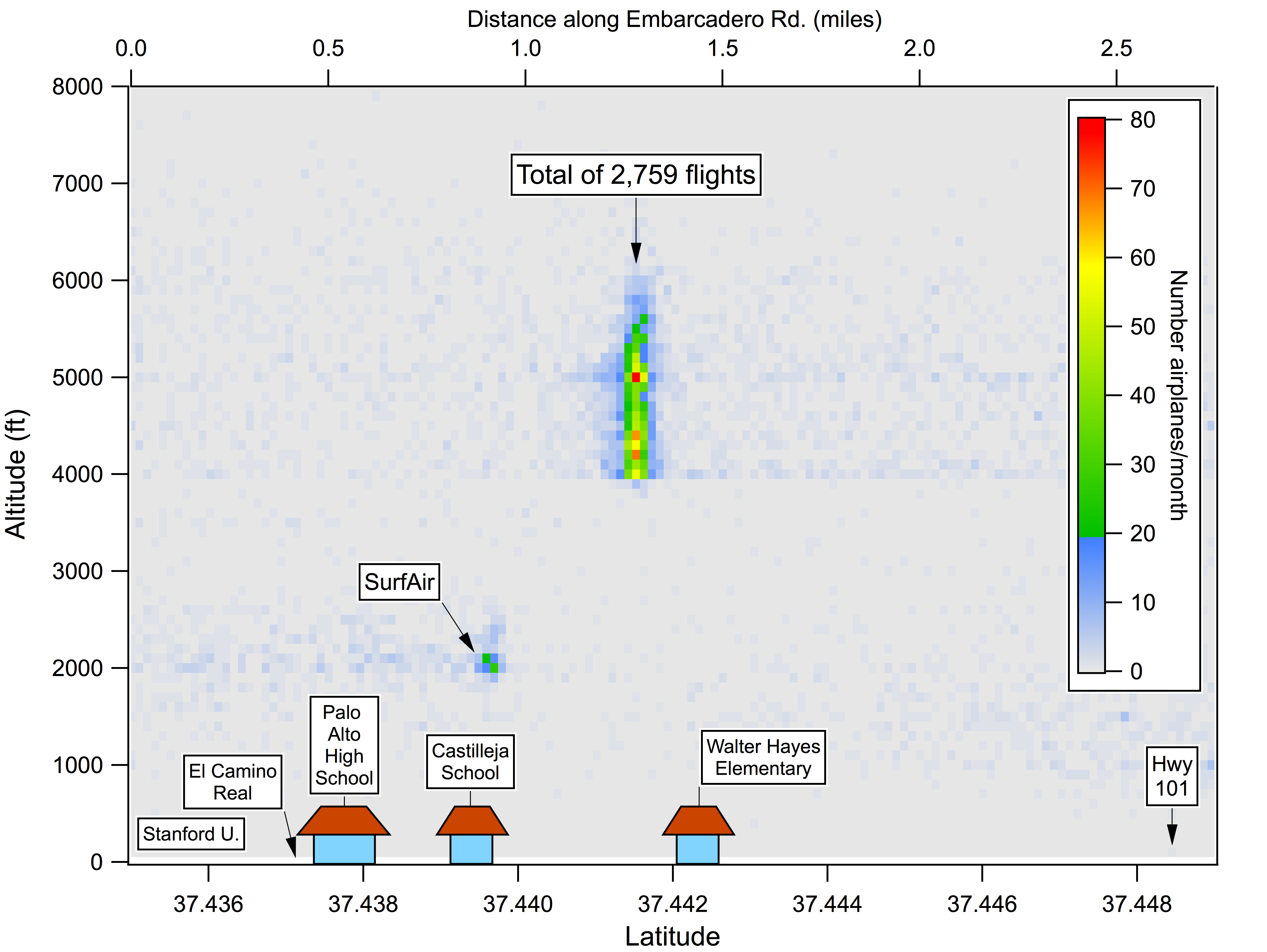
Our friend Don Gardner has done some wonderful analysis of our FOIA flight track data. Imagine a geometric plane (black line) extending along Embarcadero Road from Stanford to Highway 101. Each time an airplane intersects this plane, it registers a ‘blip’ on a heat map and the altitude is recorded.
Above is a heat map showing all the flights that pass through the ‘window’ during the month of September, 2013. The most sound energy (particularly at low frequencies) is delivered not immediately under the flight track vector, but in 2 swaths adjacent to the vector. Walter Hayes and Castelleja Schools are getting a good dose of noise.
Here is a similar graph for September, 2015. Note that the number of flights passing through this corridor has almost doubled. Remember when SFO was saying “Nothing has changed”?” The path has shifted slightly to the northeast. The proportion of flights near the bottom of the 4000-5000 foot altitude window has increased. The altitudes have a bimodal distribution.
Sky Posse advocates for “Equitable Distribution” This is not equitable distribution.


